The colors we choose for our walls do more than simply decorate a space—they transform how we feel, function, and interact within our homes. When anything feels stale or uninspiring in your living environment, a fresh coat of paint might be the most accessible solution. Many homeowners don’t realize that revitalizing their space doesn’t always require extensive renovations or expensive furniture. Sometimes, the services of a reliable handyman and a thoughtful color selection are all you need to completely reimagine your surroundings.
Paint colors have the remarkable ability to make small spaces feel larger, dark rooms appear brighter, and cold environments feel warmer. The possibilities are truly limitless when you understand how different hues interact with your space’s architecture, lighting, and purpose. Unlike major renovations that might require specialized contractors, paint transformations are possible for almost any homeowner to achieve, either as a DIY project or with the help of a professional handyman. With the right preparation and color selection, you can create dramatic changes that affect not just the appearance of your home, but also how you experience it daily.
- Select paint colors that cater to function, size, and natural lighting conditions. Source: Jill Connors – thisoldhouse.com
The Psychology Behind Paint Colors: How different hues affect mood, from energizing warm tones to calming cool shades, and their role in setting your home’s emotional atmosphere
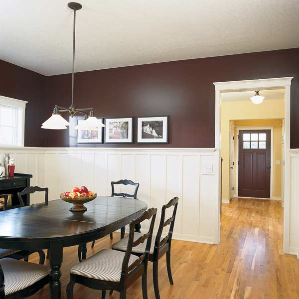
Color psychology plays a profound role in how we experience our living spaces. Warm colors like reds, oranges, and yellows tend to energize and stimulate conversation, making them excellent choices for social areas like dining rooms and kitchens. These vibrant hues can create an atmosphere of warmth and welcome that naturally draws people together. On the flip side, cool colors such as blues, greens, and lavenders promote relaxation and tranquility, making them ideal for bedrooms and spaces where stress reduction is the goal. Understanding these fundamental emotional responses to color is essential when planning your home’s ambiance, as anything from subtle shifts in shade to bold color choices can dramatically alter how a space feels.
Beyond the basic warm-cool spectrum, individual colors carry specific psychological associations that can be strategically deployed throughout your home. Yellow stimulates mental activity, making it valuable for home offices or study areas, while certain shades of blue can lower blood pressure and heart rate, creating genuinely restful environments. Green bridges the gap between warm and cool, offering a balanced, refreshing quality that works in almost any room. When considering a paint transformation, it’s possible to work with a handyman who understands not just the technical aspects of painting but also how color selection impacts daily life. The right professional can help translate your desired mood into the perfect color palette, ensuring your home’s atmosphere aligns with your emotional and functional needs.
- Select paint colors that cater to function, size, and natural lighting conditions. Source: Jill Connors – thisoldhouse.com
Strategic Color Selection for Different Spaces: Selecting the right paint colors based on room function, size, and natural light conditions to achieve desired effects
Each room in your home serves a unique purpose, and your paint color selections should reflect those distinct functions. For bedrooms, where relaxation is paramount, soft blues, lavenders, and muted greens can create a sanctuary-like atmosphere that promotes better sleep and stress reduction. Conversely, social spaces like living and dining rooms benefit from warmer tones that stimulate conversation and create a welcoming environment for guests. When working with a handyman to update your spaces, discussing the primary activities that happen in each room can help guide your color decisions. Anything from homework to entertaining to meditation requires different environmental support, and paint color is one of your most powerful tools for creating appropriate settings for these varied activities.
Beyond function, the physical characteristics of your spaces significantly impact how colors will perform. Small rooms generally benefit from lighter colors that reflect more light and create an illusion of spaciousness, though deep, rich colors can sometimes create a cozy, intimate feeling in compact areas. Rooms with abundant natural light offer more flexibility, as the changing daylight throughout the day naturally alters color perception. North-facing rooms, which receive cooler, bluish light, often need warmer paint tones to counterbalance this effect, while south-facing spaces with golden light can handle cooler colors without feeling chilly. It’s possible to dramatically transform problematic spaces—from dark hallways to oversized rooms that feel too cavernous—with strategic color choices that correct for architectural and lighting challenges. A knowledgeable handyman can often provide valuable insights about how certain colors might perform in your specific spaces.
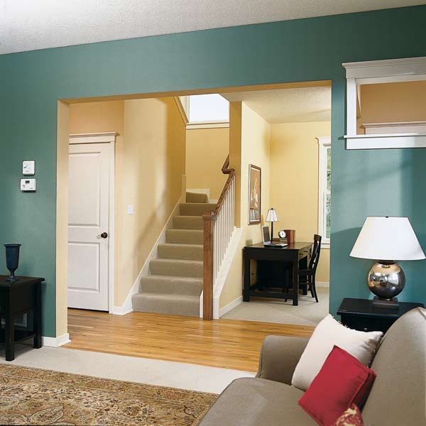
- Harmonizing different paint colors can maintain individuality and cohesion. Source: Jill Connors – thisoldhouse.com
Creating Visual Harmony: Techniques for developing cohesive color schemes throughout your home while maintaining distinct character in each space
Developing a harmonious color flow throughout your home doesn’t mean painting every room the same color. Instead, it’s about creating thoughtful transitions that guide the eye naturally from space to space. The 60-30-10 rule offers a practical framework: use your dominant color for 60% of the room (typically walls), a secondary color for 30% (often large furniture pieces), and an accent color for the remaining 10% (accessories and artwork). This balanced distribution creates visually pleasing spaces that don’t overwhelm the senses. When planning a whole-home color scheme, it’s possible to vary these percentages slightly from room to room while maintaining colors from the same family, creating unity with variety. A skilled handyman can help implement these color transitions with professional precision, ensuring clean lines between different hues.
Open floor plans present unique challenges for color harmony, as multiple functional areas share visual space. One effective strategy involves using color to define different zones while maintaining a cohesive palette. For example, a slightly deeper shade might designate the dining area within a great room, while a lighter version of the same color family continues into the living space. Another approach is to use a consistent neutral for most walls while introducing color through furniture and accessories, which can be changed more easily as tastes evolve. For homeowners struggling with color decisions, starting with existing elements like a favorite piece of artwork or textile can provide a ready-made palette. Anything that resonates with you emotionally can serve as inspiration for a cohesive color scheme that reflects your personal aesthetic while creating visual flow throughout your home.
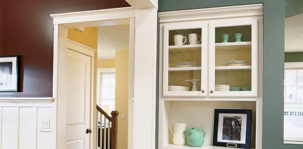
- Smart paint choices highlight architectural elements and complement furniture, enriching ambiance. Source: Jill Connors – thisoldhouse.com
How paint colors interact with furniture, architectural features, and lighting to transform your home’s overall ambiance
Paint’s influence extends far beyond just covering walls—it creates a backdrop that dramatically affects how we perceive everything else in our spaces. The same furniture pieces can look entirely different against various wall colors; a navy blue sofa might recede into a similarly toned wall or stand out dramatically against a light neutral background. Strategic color placement can highlight architectural features worth celebrating or minimize less desirable elements. For instance, painting crown molding and trim in crisp white against a colored wall draws attention to these craftsmanship details, while painting an outdated brick fireplace the same color as surrounding walls helps it blend seamlessly into the background. These intentional choices demonstrate how anything from built-ins to beams to doorways can be enhanced or downplayed through thoughtful color selection.
Lighting conditions transform how paint colors appear throughout the day, creating a dynamic experience in your living spaces. Morning light, afternoon sun, and evening lamp illumination will all reveal different qualities in your chosen paint colors. This is why testing paint samples under various lighting conditions is crucial before committing to a whole-room application. Additionally, the finish you select—from flat to high-gloss—affects how light interacts with the color, altering both its appearance and the room’s overall ambiance. Flat finishes absorb light for a velvety look that hides imperfections, while glossier finishes reflect light, potentially making colors appear brighter while adding a sense of dimension to walls. A knowledgeable handyman can guide you through these considerations, helping you select not just the perfect color but also the ideal finish for each space, ensuring the possibility of creating exactly the atmosphere you envision for your home.